How Customers Compare Two Tradespeople's Websites Side by Side
Customers compare two tradespeople's websites by opening them in two tabs and checking the same seven things: what you do, where you work, proof of the work, a price, how to get in touch, how it looks on a phone and whether it loads quickly. The page that answers those soonest usually gets the call.
The ad at a glance
| Question | Answer |
|---|---|
| Who it is for | Trade and local service owners who want to understand what happens when a customer has two of their websites open at once. |
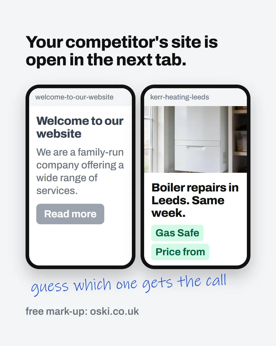
| What it shows | Two phone screens side by side. One says "Welcome to our website" and "We are a family-run company offering a wide range of services." The other shows a boiler photo and "Boiler repairs in Leeds. Same week." Handwriting underneath says "guess which one gets the call". Both pages are examples. |
| Where it applies | Across the UK, with a focus on London and the South East, where we are based. It is aimed at small local businesses wherever customers search for them. The example firm in the ad is set in Leeds, and the same advice applies in any town. |
| Why we published it | It turns a vague worry about "a better website" into a concrete test an owner can run. |
What does the two-tab comparison look like?
A customer has a problem and two or three names. They search each name or tap each listing and open the websites next to each other. They are not reading. They are scanning, flicking between tabs and asking a handful of fast questions. The winner is rarely the firm that does better work. It is the firm that makes the answers easiest to see.
This is the situation we described in why customers pick the site with photos and a price. The comparison is where a recommendation is won or lost.
Which seven things do customers check?
| What they ask | What a clear page shows |
|---|---|
| What do you do? | The trade in the first line, in customer words |
| Where do you work? | The town or area written in plain text |
| Is the work good? | Photos of finished jobs, not stock images |
| What will it cost? | A starting price or an explanation of how you quote |
| Can I trust you? | A registration number, review link or guarantee |
| How do I reach you? | A tappable phone number and a second route |
| Does it work on my phone? | Readable text, big buttons and quick loading |
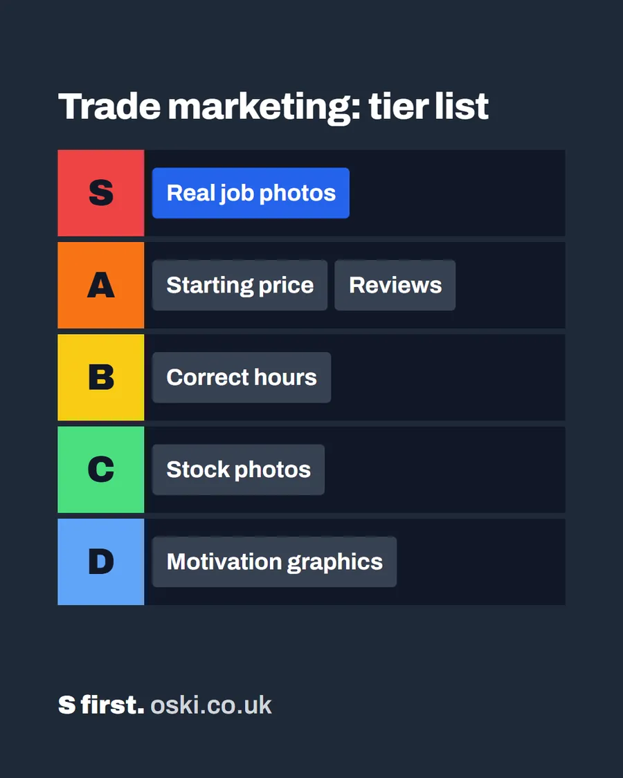
Our guide to what matters most on a tradesperson's website ranks these by how much each one matters.
What does the winning page do first?
It puts the first three answers above the first scroll: what you do, where, and one photo of real work. Then the contact button. If you can only fix one thing this week, move those three to the top of the homepage.
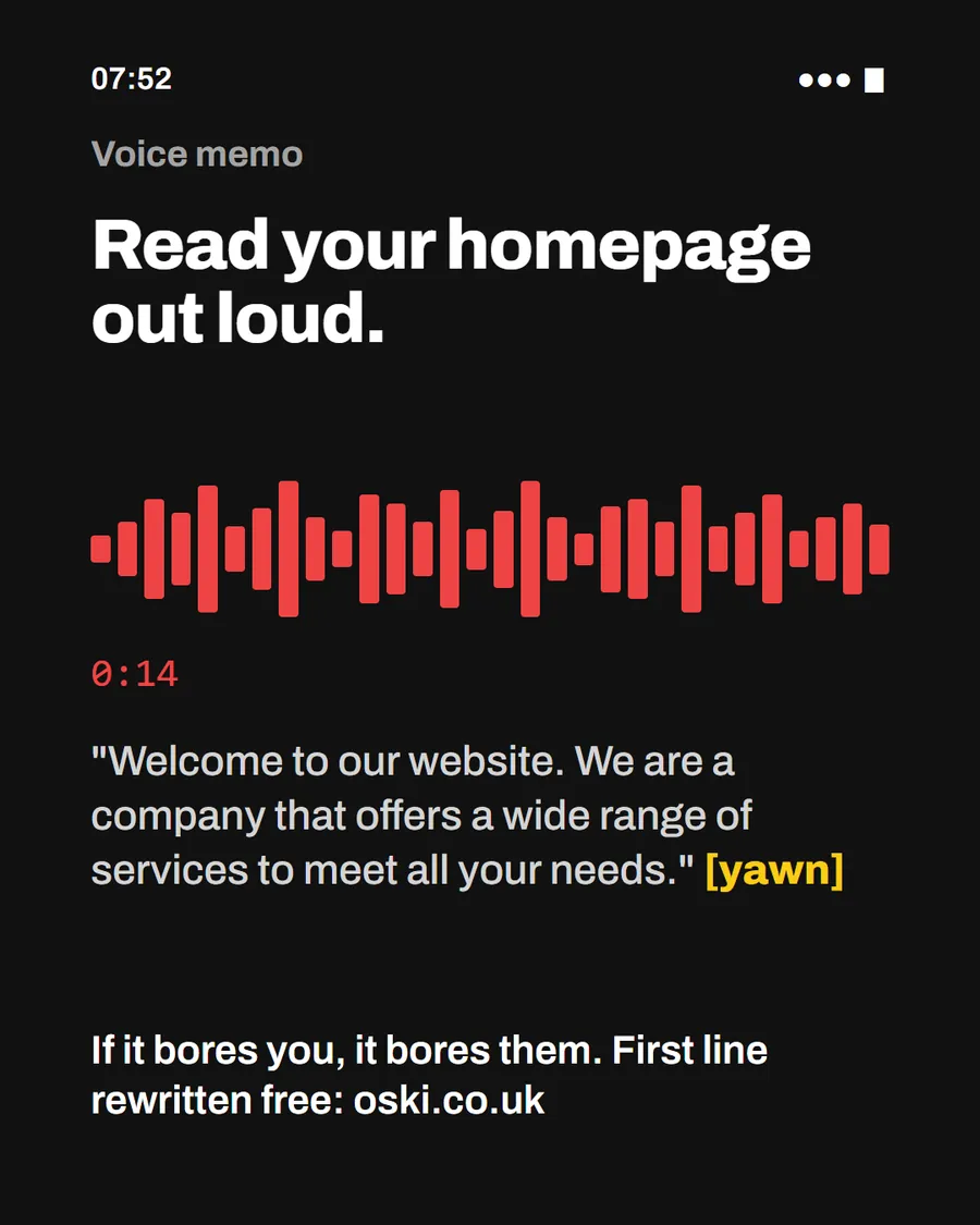
The losing page tends to start with a welcome, a paragraph about how long you have been trading and a slideshow. All of that might be true, and none of it helps someone who has two tabs open. We explain how to write the opening line in what the first line of your homepage should say.
How should the page look on a phone?
Test it with your thumb. Can you read the first screen without zooming? Is the phone number a button, not plain text? A tel: link lets a phone dial straight away, as the MDN documentation explains for cellular devices. Are the buttons big enough to tap without hitting the wrong thing? Does the page load quickly on mobile data?
Also check what appears in the search result before the click. Google's SEO starter guide says titles should be clear, concise and accurate, and a local title can include the business location. A title that says "Home" wastes the first thing a customer reads.
How do you run the test on your own site?
Do it as a fair fight:
- Search for your trade and town on your phone, and open the first two competitors.
- Open your own site in a third tab.
- Give each ten seconds, and write what you learned from each: the trade, the area, the proof, the price, the contact route.
- Mark each answer yes, partly or no.
- Look at where you scored lowest. That is your first fix.
Better still, give the phone to a friend who does not know the businesses and ask which one they would ring and why. Their answer is the one that counts.
What do customers do when both pages look the same?
They look for a tiebreaker. The usual ones are the most recent reviews, the quality of the photos, whether a price is shown and who answers first. If both firms are equally clear, speed of reply often decides it: the firm that texts back within the hour tends to win the job, because the customer has already moved on to the next thing.
That is why the page and the response go together. Our post on the cost of missed calls looks at the second half of the process.
Does a smart design matter?
Less than clarity. A plain page with a clear first line, real photos and a big phone button beats a polished page with a slideshow and a vague headline. Avoid pop-ups that cover the content, tiny text and carousels that move before anyone has read the first slide. Keep contrast strong, fonts readable and the layout simple.
If you do not have a designer, you do not need one to win this comparison. You need the words and photos to answer the seven questions, and a layout that gets out of the way.
What to do this week
- Run the five-step test above against two local competitors.
- Write down the three questions your site answers worse than theirs.
- Move your trade, town and one real photo to the top of the homepage.
- Check that your phone number is a button and your page loads quickly on mobile data.
- If you want us to run the comparison for you, send us your web address and two rivals.
Frequently asked questions
How do customers compare tradespeople online?
They usually open two or three listings or websites side by side and look for the same few things: what you do, where you work, proof of your work, a price and an easy way to get in touch. The clearest page tends to win.
What do customers look at first on a trade website?
The headline and the main photo. They want to know within a few seconds what the firm does and whether the work looks real. If both are vague, they close the tab and open the next one.
Does a trade website need to be fast?
Yes. A page that takes a long time to load on a phone can lose the visitor before they read anything. Keep images sensible in size and avoid heavy pop-ups.
How can I test my website against a competitor's?
Open both on your phone, one after the other, and write down what you learn from each in ten seconds. Better still, ask someone who does not know either business to do it and tell you which they would ring.